1. My expectations were to learn about the elements and principles of art and I learned much more.
2. I define art as a way of expression and creative which is pretty similar to my original posting.
3. Leonardo Da Vinci is my favorite artist now because of portraits and the way he uses the elements of principle he really captures my attention.
4. I am very happy i took the course and would recommend it to others.
Thursday, December 13, 2012
self portrait

1887
George Peter Alexander Healy
Oil on Canvas

1889 (250 Kb)
Oil on canvas
65 x 54 cm (25 1/2 x 21 1/4 in)
Musee d'Orsay, Paris

REMBRANDT VAN RIJN
“Self-portrait”, 1659
oil on canvas, 52.7- 42.7 cm., Edinburgh , National Gallery of Scotland

Gina Giardina
Sketch

I chose these self portraits because they are either inspirational artists or men that have had a major impact on the world. I found them inspirational because I know who they are and some background on them so they inspired me in my self portrait. The challenges I faced are I am not the best artist but I just brushed that aside and did the best I could do. It represents me because I am always happy and smiling so it is a great representation of my personality. I applied shading for my hair, eyebrows, and eyes. I used line for my hair and most of my face. I also applied balance and symmetry because I used the whole page and tried to be as symmetrical as possible. I enjoyed creating this piece because it was fun to do and I got to be creative. I think it is the best I could possibly do so I like the final product.
Sunday, December 9, 2012
Art Curation Review
1. Which projects did you review?
The projects that I had reviewed were the Captured Moments during the 70s, The Queen City, and All about the Landscapes.
2. Why did you select the Exhibit you critiqued?
I selected Captured Moments during the 70s because I enjoyed looking at the photos. It felt like I was experiencing a little piece of the event taking place. I really enjoy realistic art. I also enjoy history so I was very engaged by this exhibition.
3. What challenges did you face in writing the critique article and how did you overcome them?
The challenges I faced in writing was where to start and how to organize exactly what I want to say. I overcame it by jotting down what I wanted to address in each paragraph and then just wrote how I felt about the photos and the exhibition as a whole.
4. How do you feel about critiquing your peers work?
I do not mind critiquing my peers because I think it is nice to get to voice your opinion on a specific work. I also have no problem expressing my views and feelings to my peers.
5. Would you like to read the critique your peers wrote about your Art Curation Project?
I would like to read what my peers wrote about my project. I put in a lot of time and effort, and would like to know what others had to say. I enjoy constructive criticism because it helps me to learn from my mistakes and not do them again.
6. On a scale of 1-10 how would you rate your finished article and why?
I would rate it a 10 because I expressed exactly how I felt and touched on main points of the exhibition. I thought I put a good amount of effort into my article and think it was the best I could do.
7. Did you enjoy working on this project?
I did enjoy working on this project it opened my eyes up to different areas and ideas of art. It was also nice to get to see my peers exhibitions. I think everyone did such a great job and it was nice to be able to view others hard work.
Wednesday, December 5, 2012
Video Review
Greenberg on
Pollock: An interview by T.J. Clark
The key
concepts/ideas are Greenberg was told in the 1940s that one day Pollock would
be a great painter. Pollock painted his first spatter-drip piece in
1947. Although Pollock despised easel painting, his paintings remained
until the end easel. He knew that his paintings weren't murals but rather
goes from the easel to the mural. Pollock started to move away from
orderliness although Greenberg believes that his paintings were orderly.
Pollock is associated with Dionysian. Pollock refused some of his own
works. Greenberg states that this is because they were not appealing
to the eye. Pollock chose his way of applying paint because of the way
the paint broke the plane. His "drip" paintings can be
characterized as Apollonian instead of Dionysian. Pollock felt alone and
isolated. Artists wanted fortune and fame during Pollock's
time. Pollock only sold about one picture a year during that time.
Pollock at the end of his life wished he would have looked more at
impressionists.
An Introduction to
the Italian Renaissance
The key concepts/ ideas of the Italian Renaissance are the renewal of excitement for the arts. Natural beauty was the center of
ancient roman art until the Barbarians took over. Giotto was among some
of the firsts to give life back to the realistic style of the Romans by using
perspective found in architecture and landscape. Ghiberti was an
apprentice under Giotto. He created beautiful biblical scenes out of door
panels. Donatello created the sculpture of "David." The
figure stands on one leg and is considered beautiful in its nude form.
Uccello makes new ideals of animal and human figures. Masaccio's figures
portray psychological and physical depth. Francesca experiments with,
"The Madonna and Child," which contrasts light and dark value to add
depth. The Catholic Church conveys Christianity through art. Da
Vinci used science and math to appear natural in their context. Raffaello
is considered the master of composition.
I think these videos will help with the art criticism project because I think any information going into being a critic of someone else's work will be helpful. It is a little more information than I had before going into the project. There were many things I learned from the two videos therefore I think they will aid in my art criticism project.
I enjoyed the videos they taught me more about the Italian Renaissance and I learned more about the life of Pollock. They did add depth to my understanding of art criticism by giving visuals and ideas of how to be an art critic. The videos were very helpful.
Sunday, December 2, 2012
Reflections on Art Curation Project
The process I went through in creating my project was I did a lot of research before I actually began my project. I researched different areas of art that I found interesting. I wanted to do some type of theme of actors and actresses paintings of those who have passed away at a young age. I was pretty passionate about doing it but found there were few pictures with the material I needed for my power point presentation. I then started thinking about family and how I enjoyed reading in the textbook about realism. I them thought of combining the two. The family impact on realism was what I came up with. I chose this theme because to me my family means everything. We do everything together and are best friends. It only seemed fitting to pick a theme that was related to family. I then started my journey to find art work. I found much artwork on this theme and enjoyed searching for different pieces of art. That is how I ended up choosing my theme. It was a long process to complete this project. There was a lot of looking at different artworks and analyzing, describing, and explaining why I chose each photo. Although it was a long process I enjoyed doing it and finding and organizing different artworks that fit into my theme.
Tuesday, November 20, 2012
video review
Displaying Modern Art: The Tate Approach
In 1929 the MOMA portrayed modern art in chronological
order. It represented each art movement
in the 1920s questions arose on the traditional ways of portraying modern
art. The museum was explored by artists
for ideological and political context.
In the Tate Modern there are four sections that display modern art. In the four sections there is a theme
provided in each section and exhibition of the modern art selections. The visitors to the Tate saw abrupt changes
between the display rooms unlike MOMA’s feature of chronological order. Critics believe when visitors go to Tate
Modern’s thematic presentation they should have no previous knowledge of
art. Many abstract artists attempt to
portray social vision, aesthetic effects, and convey emotion. They do not want their paintings to be based
on figuration. I found this video
helpful because it made me think about how I would like my exhibit set up. It made me think if I would like it in
chronological order or more of a scattered look. I thought this video was good and helpful
when thinking of creating an exhibit. It
gave me some things to think about for my exhibit.
The lowdown on Lowbrow: West Coast Pop Art
Robert Williams the artist says that he invented the term
Lowbrow but doesn’t like its meaning.
Car culture, pop culture, and folk art had major influences in Lowbrow
art. It is said by Lisa Petrruci that
art is less esoteric and more relatable.
The time after WWII which is known as “atomic age” is also important to
Lowbrow art. Art entails many different
areas that range from concept art to paintings.
During the 1960s the gallery and artists spoke of Ed “Big Daddy” Roth
along with psychedelic Rock working on underground comics. There was a time where galleries weren’t willing
to portray Lowbrow art. The Laguna Art Museum
put together a show which featured Robert Williams, Von Dutch, and Ed Roth. Robert Williams believes that the art world
is set up to portray and promote certain types of generation artists got there
work across through album covers and fliers.
After a book was featured about female Lowbrow artists the Tart gallery
in Vancouver received more acceptance and recognition. In an attempt to promote lowbrow art. Billy Shire opened the shooting gallery in
San Francisco. Robert Williams is in
high demand all over the world while 20 years ago no one would hardly show is
work. I think this video helps me with
my art exhibition creation because I may want to do something that involves
paintings of actors and actresses who have passed away. This may fall into pop culture. I found this video interesting because I didn’t
even know what lowbrow art really was until watching this video. I learned a lot on the particular topic.
Bones of Contention: Native American Archeology
During the genocide in America against the Indians Native
American’s bones were collected to be studied.
Anthropologists disagree whether the bones should or shouldn’t be
returned to their ancestors. A road
construction worker found a body. The
bones are taken to be studied while Maria Pearson fights for the bones. David Von Horn was arrested for possession of
human bone fragments. In the 19th
century Samuel Morton M.D. believes that brain size has to do with
intelligence. Native American skulls
were collected and kept in museums.
Susan Harjo leads a fight for Native people’s objects of worship. Dr. Barnes was prevented from doing Native
American migration research because of new laws. Scientists have to first determine what
tribes the bones came from. By measuring
the skull it is easier to determine where the bones need to be returned
to. The Native Americans hold ceremonies
to find out whether or not the bones are their ancestors. They do not want any of the scientist’s
history. Scientists can find out a lot
about health problems of today by studying the bones of past people. British researchers DNA test bones that are
infected with T.B. Maria Pearson
represents rights to an undisturbed Indian burial ground. The University of Nebraska was asked by the
Great Plains Omaha to analyze bones for their health and cultural
significance. Omaha women die earlier
due to small pox and an alteration in their daily life. In the early 20th century Native
Americans were deprived of their tribal identity in American boarding
schools. Native Americans now design New
York’s Native American museum. The bones
from Native Americans are still being brought home. This video does relate to the creation of my
art exhibit because I know I want to create an exhibit portraying things from the
past. Therefore this video gave me some
ideas of what I would like to include in my art exhibit. I found this video very interesting because I
never knew that Native American bones were kept and studied during the
genocide. I found it very intriguing to
learn about that particular part of history and how bones are still in the
possession of scientists.
Great Museums: An acquiring Mind: Philippe de Montebello
and The Metropolitan Museum of Art
A gallery is based on dedication and hard work. Knowledge of art is what makes the museum
flow. The background of art is very
important when it comes to understanding art work. The best way to understand an art work is by
seeing it first hand and up close. By
seeing a painting up close you can see the way the artist intended for the
painting to be viewed. You can see the
texture in the sculpture or painting.
Through seeing a work of art live you can see the way the artist had
work and see all the detail in the painting.
The hard work that goes into creating an exhibition is apparent when
viewing and makes the exhibition popular amongst visitors. The artist wants for people to come and enjoy
the exhibition and the hard work that the artist had put into creating the
exhibit. The film helps me with my
exhibition because it gives me ideas for creating my exhibition. The film was interesting and it made me think
about my exhibition and the importance of organizing and research to make sure
my exhibition flows well together.
Wednesday, November 14, 2012
Video Review
The Power of Art: Rothko
The key concepts ideas of this video are Rothko was commissioned
to in the Seagram Building, deliver paintings to the Four Seasons Restaurant. He decided to accept it but he first thought
of his role in American capitalistic society.
Rothko was a child in Russia during a violent time especially against
Jews. He believed that art could save
the world. He created the subway series
while dabbling in Expressionism. He
wanted his paintings to take on the values of contemporary society. He also did not want any psychological analysis
of his art. Many of his paintings that
were observed displayed the feelings of human tragedy. The murals he painted were never actually
hung in the Seagram building. In the
time period of 1954-1957 Rothko’s paintings multiplied. Many people described his paintings as
restful pictures where Rothko on the other hand thought of them as tragic. Rothko offered a German curator that he would
paint for free if he would build a chapel of apology for the Holocaust. He spent the rest of his life searching for a
chapel. Rothko was a heavy drinker and
smoker. He began to paint darker and
darker paintings. When he was allowed to
paint whatever he wanted for a Texas Chapel, he painted only in black.
I chose this video because I wanted to learn more about
Rothko. I wanted to know his background
story. I am glad I picked this video
because it provided me with just that.
Andy Warhol: Images of an Image
The key concepts/ideas of the video are Andy Warhol was a
commercial artist. In 1960 he decided to
start experimenting with images for advertising. He died in 1987. He was very interested in the lives of
Elizabeth Taylor and Marilyn Monroe.
They had inspired many images.
Photographs are enlarged and displayed on screens of silk; they are then
transferred to canvas and paper, using paint and ink. In 1963 he created Ten Lizes, which was
featuring Elizabeth Taylor. He saw the
silk images as a means to make some money.
He then began to film and photographs his friends. He then added paint to the silk images. His work addressed race riots, cultural
revelation of China, the moon conquest, and the universal dollar.
I chose to watch this video because I have heard of Andy
Warhol and thought this would be a good opportunity to learn a little bit more
about him. It is nice to put a face to a
name.
Sunday, November 11, 2012
Art Gallery Visit # 2
Albright Knox Art Gallery
Visited on 11/8/2012
Step 1: The Exhibition
Questions
about the exhibit:
1. What is the title of the exhibit?
2. What is the theme of the exhibition?
1. What is the title of the exhibit?
2. What is the theme of the exhibition?
1. The title of the exhibition is Decade:
Contemporary Collecting 2002-2012.
2. The theme of the exhibition is characterized
into ten themes which are Insidius Humor, Language is a Virus from Outer Space,
Film/Photography/Fiction, L.A. Angels, Psychology of Space, Shape of Space,
Sculpture in the Expanded Field, Social Space/Private Ritual, What happened to
the paining?, and the Wayward line.
Step
2: The Gallery
Questions
about the physical space:
1. What type of lighting is used?
1. What type of lighting is used?
The
pictures at the gallery had recessed lighting at the top of them. The lighting brought attention to the work of
art being observed. The gallery also had
recessed lighting throughout the halls of the gallery that I noticed while
walking around.
2. What colors are used on the walls?
The color
used on the wall is a creamy white color.
The color of the wall really helps the painting to pop out. There are no bright colors on the walls so
your eyes don’t get distracted when looking at the work of art.
3. What materials are used in the interior architecture of the space?
The floor
of the gallery is kind of a marble type floor it is a very shiny hard
surface. It is a very light colored
floor kind of like tope color. It is
very plain. The walls at the bottom have
black trim from the bottom of the wall to the floor. The ceiling is white with many recessed
lights along the ceiling.
4. How is the movement of the viewer through the gallery space?
There
were many halls in the gallery. The
works were all very spaced out from each other.
The paintings being so spaced out made me feel if it was to help to
clear your mind along the way. The
paintings being so spaced out also helped to not have any interference when
concentrating on one work. The halls
were spacious and didn’t have any unnecessary objects in the way. Everything appeared white except for the
works.
Step 3: The Artwork
Questions about the artwork:
1. How are the artworks organized?
1. How are the artworks organized?
The works are well organized.
They are perfectly spaced apart so your eyes don’t start wander away
from the artwork you are looking at. The
artworks that related to one another tended to be around each other. Such as the works with the nude paintings,
there were other nude paintings in the same area. The paintings were also the perfect height
which was about eye level. If they would
have been lower it would have been difficult to keep looking down. The lighting above each work also helped the
work to pop out at you.
2. How are the artworks similar?
They are similar because they all neatly laid out. The works that require a require a frame have
a frame and they are about the same height.
They all have a white mount next to the artwork that describes the work.
3. How are the artworks different?
They are different because they are all created in different
ways. Artwork is different from work to
work, that is what makes it so special.
No work of art is the same.
4. How are the artworks framed?
They artworks are framed with silver, bronze, gold, and white
frames. I even noticed some works were
framed with wood frames. The frames were
heavy looking and classy.
5. How are the artworks identified and labeled?
They are identified by the title, artist, media, and year. There is a little white mounted card to the
right of the work. The card provides the
details of the work.
6. What is the proximity of the artwork to each other?
The artworks are spaced out from one another. There is enough space between the artworks so
they don’t interfere when looking at a particular piece of art. It is the perfect amount of space apart when
looking at art.
Step 4: Art Criticism Exercise


Artist: Giacomo Balla
Title: Dynamism of a Dog on a Leash
Year: 1912
Media: Oil on canvas
The artwork portrays a small dog being
walked. It shows the leash swinging to
let the viewer know someone is holding the leash that is attached to the small
dog’s collar. The use of line shown in
this work as the ground the dog is walking upon has lines all over it. The use of a gray scale is used in the
picture. The dog and the owner’s bottom
of its body are black while the ground is a gray along with the leash being a
light gray. The emphasis of the work
appears to be on the dog. When looking
at this particular piece of artwork it reminds me of walking my dog on cold
dark day. That is why I was so drawn to
this particular piece because it reminded me of myself. I believe the artist was trying to make
people relate to this work. Many people
have animals or have seen a dog being walked.
It gives off a feeling of knowing the dog or had seen this dog before. I believe the artist wanted the viewers to
have an emotional connection with the dog and the dog walker.


Title:
Peasants in the Fields, Eragny
Artist:
Camille Pissarro
Year: 1890
Media: Oil
on canvas
The
artwork depicts a man and woman working in a field or on a farm. The man is shoveling the ground while the
woman stands and watches while holding a basket. There is a little girl sitting in the field. There is green grass behind them and many clouds
in the sky. The artist used color in
this painting such as brown, blue, tan, green, and white. Texture was used to give the ground a rough
look to it. The emphasis of the painting
is to the left side where the man and woman are. While everything to the right and behind appears
to be in the background. The work
reminds me of a hard working family on a farm.
It looks as if it is a man and his wife with their child in the
background. It makes me feel that they
work hard every day in that field. I
think the artist wanted viewers feel the effect of a hard working family. I think the artist wanted people to relate to
the feeling of working hard day after day.
The artist titled the work Peasants in the Fields which means these
people are peasants working to get by in life.
It is kind of just like people today.
We are all just working to get by in life. We are all peasants working in the field of
life.

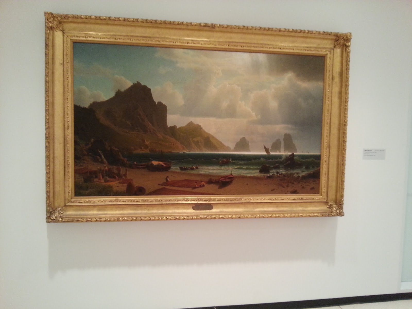
Title: The
Marina Piccola, Capri
Artist:
Albert Bierstadt
Year: 1859
Media: Oil
on Canvas
The painting portrays a marina. There is a small boat on the sand with a
mountain to the left. There is water
with the sun coming down on it. There
are clouds in the sky. There are boats
in the water and large waves. There are
also people on the shore. The painting
depicts texture on the mountains to give that rough look to them. Color is also used for the mountain, water,
sky, and boats. There appears to be
emphasis on the left side of the painting where the mountain is. Shape is also portrayed through the boats,
mountains, clouds in the sky, and people.
Movement is also used as your eyes move from the shore, to the water, over
to the hills, and up to the sky. The
painting keeps your eyes constantly moving.
The painting reminds me of a boats arriving to an island whether they
meant to or had to. It makes me feel as
if they had to stop there because of the waves being so high. I think the artist wanted to viewers to use
their imagination when looking at this painting. I also feel though as if it gives a sort of
hanging out by the water feel. I believe
viewers may be able to relate to it, such as spending a day with their
family. I believe he wanted to give an
emotional feel to it but also shed light on the beauty of nature. The hills, the water, they sky, the shore; it
is all very beautiful and tranquil.
5.


I definitely thought it was different
going to the art gallery and not completely focusing on the pictures but on the
surrounding space. I thought it was
helpful because it made me think as to why the gallery looked the way it
did. It made me ponder what the purpose
behind it. It was fun to look around and
think of and document the different aspects of the Albright Knox Art gallery.
Saturday, November 10, 2012
Video Review
Dada and Surrealism
The key concepts/ideas of the video are Kurt Schwitters in
1918 understands that there are endless options in collage. The German artists after WWI saw nonsense
everywhere. Schwitters was the founder
of a magazine called “Merz.” He represents
many objects in his artwork. Hana Hoch
was a part of the Dadaist movement. She
uses art to attack certain parts of society that disgust her. Hoch created a photomontage called “Cut with
the Kitchen Knife” which goes after the Weimar regime’s political figures. She portrays the confusion and energy in her
photomontage of the modern city. George
Grosz’s art was burned by the Nazis. He
painted “Pillars of Society” which was an attack on those he had done him
wrong. He also expressed that the end of
WWI did not end the evil of government.
Salvador Dali was a surrealist painter.
He probes the human subconscious darkest areas. He created a world that made little
sense. He portrayed many
landscapes. He settled himself in 1930
in Port Legal. In his work titled “Sleep”
he remembers the area’s rock creations.
In Dali’s works one of his favorite fetishes was crutches. He included crutches in his piece “Sleep.” In Man Ray’s “La Fortune” some of the
pictures mechanisms are true to life. He
creates an unfamiliar arrangement using familiar objects. He dedicated a series of works to the writer
Isidore Ducasse.
I chose this video because I read and answered the
discussion questions from the books reading on these two subjects. After answering the discussion questions I
wanted to know more about the topics so when I saw the videos I decided I
wanted to watch them to get a better understanding of the material.
Expressionism
Edward Munch created “Ashes” which was a piece that depicted
the challenging relationship between man and woman along with unknown of
sexuality. Munch’s creative images did
not go along with the norms of content and style; he broke many rules when
creating imagery. His painting “Ashes”
was originally named “After the Fall.”
The imagery depicts Adam and Eve.
The forms used are greatly simplified.
It is a representation of a modern Adam and Eve. Munch’s exhibition that was in Berlin in 1892
was closed due it causing much anger.
Many times Munch was turn his work into lithography. Munch’s views on sexual relationship were
pessimistic. He shared these views with
Friedrich Nietzsche, a German philosopher and August Strindberg, a Swedish
dramatist. In the work “Madonna” Munch
portrayed once again his ambiguity towards women. He referred to his works as the “Frieze of
Life,” that depicted his cynical and constant view on life. Franz Marc created “The Tiger” in 1912. Animals were his big focus. Marc was a part of a group called “The Blue
Rider.” The group was led by Kandinsky,
a Russian painter whose paintings are now perceived as the creation of the
movement of modern art. During 1913-1915
Ernest Ludwig Kirchner painted many works that represented “tarts” in the
streets of a busy city. They look to be
rushed and lead the viewer into a voyeur.
He was the founder of the “The Bridge” which was an artist’s association. Max Bechmann whose style took a dramatic turn
post WWI. He began painting in a German impressionist’s
style. With the use of bright colors and
gestures his figures are suggestive of puppets.
Anselm Kiefer was born at the end of WWII in 1945 Germany. His works refer menacingly to the war. He loves textures. He mixes his paints with real pieces of wood.
I chose this video because I have an interest in
expressionism and thought the video would be great to watch to get even more
information on expressionism.
The videos relate to the reading because they give a visual
to what the textbook is talking about.
It also gives many examples of works that portray the specific movement
being talked about. The videos also
elaborate on the material which gives a better understanding.
I enjoyed watching the videos and learning even more about
the surrealism, dada, and expressionism movements. I love history and I feel that art greatly
ties into history therefore I enjoyed the videos that aided to my interest in
history. They provided more information
to take with me to the next chapters to understand the overall art concept.
Sunday, November 4, 2012
mask making

This mask is symmetrical. The mask has a sense of balance. There is also line used throughout the mask. There is a pattern with the shapes of the mask for example the circles at the top have a specific pattern and symmetry about them. The designs on the mask seem to be equally spaced throughout the entire mask. Every marking seems to be equally apart on both sides of the mask. This mask does not have much color it is just a silver mask. The mask is proportioned on both sides. This mask looks very powerful to me. I picture an important person to be wearing this kind of mask. I chose it because it was hard to stop looking at and it made me wonder about what type of person would wear it.
masque-de-venise-luxe-cignetta-1567.jpg

It is said that this mask is made of clay. The scoring technique of this mask gives it a three dimensional shape look to it. There is color used on this mask. It appears to have some green, yellow, blue, and maybe gold on it. The left side of the mask seems to be the focal point of the mask. The left side of the mask seems to be emphasized more than the right with the lavish design. Line is portrayed throughout the mask, some of the lines swirl while others are a little straighter. The left side of the mask looks like the texture would a little hard and rougher when touching. The mask looks to me like it would be worn to a fun event like a masquerade ball of some sort. I chose this mask because it just reminded me of a fun classy time and it really stuck out to me.

Sketches


Finished Piece

I like my first finished mask. I thought it came out rather okay for my first time ever attempting to make a mask drawing. I thought it was a fun experience just be able to make it look anyway I wanted. It was also fun looking up some other masks. They were very creative and different. Overall I enjoyed the mask project.
Saturday, November 3, 2012
Video Reviews
Buddhism
The key concepts/ideas of Buddhism began in India. It then spread to other areas where it
prospered. The legends and facts of
Buddhism are twisted together in Bodh Gaya, India. One of the main teachings of Buddhism is “Tanha.” “Tanha” preaches to get rid of all desires
that may halt enlightenment. When Budha
died Buddhism split into two groups within the first hundred years of his
death. The two groups became Hinayana
and Mahanayana. The architecture of the
Buddhism age spread around India. The
core of Buddhism art and architecture is Sanchi. The Bodhi tree represents Buddha. There is a walkway that surrounds the Great
Stupa. When walking through each step
brings you to a new discovery of art and architecture of Buddhism. The biggest Shrine to Buddhism is located in
Java where a lotus-shaped Borabudur stands.
There are 432 curved Buddhas at the top of the shrine. The Chuang Yen Monastery is located in
Carmel, NY. It is buildings. There are statues within the building that
reflect the style of the Tang Dynasty.
I chose to watch this video because I have always had a curiosity
for Buddhism. I was always interested in
their beliefs and wanted to watch more on it.
African Art: Legacy of Oppression
The key
concepts/ideas of the video are the most African art is held at Belgium’s
Tervuren museum in Central Africa. The
body positions and expressions in African art led to abstract art. The masters of the 20th century
were influenced by African art. African
masks were made to frighten enemies, they were contorted features. African art was then brought to Belgian by
the people. Leopold’s army brutalized
the Africans and he then put them on display at his Tervuren museum. He wiped out half of the Congo’s population
while on his conquest for slave labor.
The western culture was influenced by Africa’s exotic curiosities. African art explores the very nature of
existence.
I chose this video because I have always liked African
artwork and I thought it would be interesting to learn more about a topic I was
interested in that’s why I picked this video.
The videos relate to the text because the text talked about
these topics. The videos provided a
visual to the reading. I always find seeing
to be more beneficial than reading because I am a visual learner.
I actually really enjoyed the films because I found the
topics to be interesting. I like
learning about different religions and their relation to art. I also find African art to be interesting so
it helped me to better understand the background of their art work. The videos help me when I am having trouble
picturing what is being talked about in the book. Therefore I learned a lot from watching these
videos.
Saturday, October 27, 2012
Art Making/Material Exploration: Exploring Line
Drawn using dominant hand


Drawn using non dominant hand
It was different using my hand as the subject manner because I never really have. I did think it was fun though using my hand as the subject of my drawing.
I used pencil for my drawing because it was less messy. I also used it in case i needed to erase at all it would be easier.
It was a little bit difficult to create a drawing with my non dominant hand. It definitely did not turn out to be what I wanted it to be. My left hand just doesn't work the same as my right. It kind of felt funny trying to draw with my left hand.
My final drawings are kind of similar. The difference is the drawing that I used my dominant hand for looks neater and is more defined where the drawing with my non dominant hand looks shaky and not as neat. I do think this was a successful study. It portrayed the difference between using a dominant and non dominant hand in a drawing. The results appear quite obvious from the drawings above.
I would not consider using my non dominant hand in the future to create artwork. I won't because it was difficult to use my left hand to draw and it was hard to control the look of my drawing. Therefore I will not be using my non dominant hand any time soon to create artwork.
Video Reviews
The Drawings of Michelangelo
The key concepts/ideas of this video are through looking at Michelangelo's drawings we can see his techniques and how he is a perfectionist. Michelangelo claimed to not be influenced by Ghirlandaio through his artwork but when compared there are similarities between the artists. The "Pieta" was Michelangelo's signature sculpture. It was surprising how much he knew about human anatomy for that particular time. The sculpture of "David" was the first colossal marble sculpture to be carved since antiquity. When his drawings were analyzed it was revealed that he emphasized the solar plexus of human figure. The Sistine Chapel was Michelangelo's greatest and most difficult work. In 1508 he began by painting the ceiling of the Sistine Chapel. Michelangelo was then called by the Medici pope to design the Medici family church in San Lorenzo. In the end it became a funeral home and family tomb. He had a strong passion for the male form. It is believed that Christianity was his artistic driving force. Michelangelo created his Crucifixion drawings while thinking of his own death. He explored feelings of dread and hope.
I chose this video because I always loved the painting of the Sistine Chapel along with other works of Michelangelo. Therefore i chose to watch this video to learn more about Michelangelo and his works of art.
La Primavera (Botticelli)
The key concepts/ideas of Botticelli's "La Primavera" is it has been fro centuries subject to many interpretations about the meaning. The great size and presents captures visitor's attention in the gallery. There are nine figures that stand in a meadow. Botticelli worked under Fra Filippo Lippi as an apprentice. He learned how to depict female movement. This was done through drapery techniques. "La Primavera" brings out religious sentiments. Venus and Cupid are referred to the virgin and child. They are portrayed in the same light. It is said the painting was originally commissioned for Lorenzo's nephew as a wedding gift. It is said it hung over the bed in a Florentine townhouse. Botticelli's paintings portrayed themes of rape and violence. "La Primavera" portrays the opposite and how life can end in a happy marriage. The secret to Botticelli's ethereal magic in his paintings is he paints with egg tempura. Certain flowers in the painting are associated with marriage. In 1743 the last Medici died and passed on the painting to the city of Florence. It caused a sensation in the early 19th century. Simeon Solomon responded to the "La Primavera" was great feelings of sadness due to the artist's sexuality. The painting is often mocked and is in high demand with its sexual overtones. Flora is the most popular figure in the painting. It is a beautiful Florentine. The question does remain if the character in question is a male or female in the painting.
I chose this painting because I have heard of it and new there was some controversy associated with it. Therefore when I saw it was one of the choices in videos I had to hear more about it. I picked the video because I had a little background knowledge of it and was wondering more about it.
How do the videos relate to the readings in the text?
The videos relate to the text because they elaborate on the reading material by providing a visual. The movies help us to visually place the readings and give us a better grasp on it.
What is your opinion of the films? How do they add depth to understanding of the readings and art concepts?
I liked the films because I had some previous knowledge on them before watching. I found them very interesting and entertaining to watch. They add depth because they provide some background on the art that we see in the book. The videos help us to have a better understanding of how and why these paintings were created.
Saturday, October 20, 2012
Video Reviews
More Human Than Human
The human form creates a great obsession for artists. None
of the world’s most famous images of the human body actually resemble a human
being. One of the first images found was in 1908 at the Danube river valley. It
was an intact statute of a female figure. Venus Willendork gives clues to the tendency
to make unrealistic human figures. It is thought that the human brain of our
ancestors was preprogrammed to exaggerate female features that were of the
upmost importance. As the weather changed nomads gathered along the river. The Egyptians
used images of the body very often in art. On the Tomb of Ramses VI there were
thousands of human body images. The figures were not exaggerated though.
Egyptians created images of the body for 3000 years consistently. Ancient
Greeks were also fixated on the human body. They believed in many gods and
goddesses. The Greeks believed the gods took human form and had beautiful
bodies and good looks. Greek and Egyptians ways of making larger sculptures.
Polyclitus made a break thought in art by dividing the body into quadrants and
moved the parts of the body to give a sense of movement. He captured the way
parts of the body moved the tenses and relaxed body and poised for action. The
Riace bronzes give the idea that a culture that is able of realism chooses to
exaggerate the human body. Today, the art of caricature is driven by the human
desire to exaggerate what is important to a culture.
I chose this video because I found the title interesting and the video was interesting. I liked how the talked about the human body as art.
Late Gothic Art and Architecture: England, 1400-1547
The key concepts/ideas are in the 15th and 16th centuries
there was a time of faith and consumption in England. People then began buying
more things. Henry VII was a part of the Tudor Dynasty. He added perpendicular
style Chapel to Westminster Abbey. This chapel was dedicated to the Virgin Mary
in 1503. Lord Cromwell commissioned Tattershall Castle which is a building
which was the top limit of what a person is allowed to build. In the 15th
century the pilgrimages demonstrated piety. The middlehan Jewel is full of
religious images. Hans Holbein wants to make sure Henry VII is known as a
patron. Many art books and objects were sent in from Europe. The regional
architecture of wealthy East Anglia is notable for its extensive wooden roofs.
Churches became a place of worship and socialization in the community. The tomb
monuments were sculpted into emaciated figures. The end of the middle ages was
the end of king Henry VIII reign. There were many great works of art that came
out of the middle ages.
I chose this video because the title stuck out to me and I like to learn about the order of the ways art progressed throughout history.
A word Inscribed: The Illuminated Manuscript
Most people during the middle ages were illiterate. Scribes
worked hard to preserve events in order and knowledge. In old manuscripts it
tracks the process of making a book. The
process is scraping the animal skin to making the hasp of the book, lastly it
is used to teach others when the book is finished. Scribes worked in some poor conditions such
as an aching hand, poor weather, difficult texts, and tired bodies. They worked hard and believed their work
makes up for a life of sin. In the 13th
century there were many changes throughout Europe. Increases in cities and trade between areas
made reading a necessity for business.
Toward the end of the middle ages there was an increase in luxury
books. These books were romances,
histories, and prayer books. The
invention of the printing press ended the need for scribes and illuminators,
although there work should not be forgotten.
They were extremely devoted individuals.
I chose this video because I find it interesting how hard the scribes worked to capture events and why they did it.
The videos relate to the text by elaborating and portraying a visual from the information in the text. The videos really help to capture the meaning in the text. It also helps when your having trouble picturing some of the information in the text. It gives you the visual.
I like the videos they taught me about the human body as art, more on the history of art and how it impacted religion, and scribes. I especially liked watching the video on the scribes. I find their work fascinating and the reasoning behind working so hard at it. Overall i enjoyed the videos and they continued to add to my knowledge base of art.
Saturday, October 13, 2012
Video Review
Architecture: The Science of Design
The key concepts/Ideas of the video are when we run out of space to build, we build up. We are running out of room to build, skyscrapers become more apparent. With skyscrapers being more popular, new materials are needed such as steel and cement. Steel is apart of the skeletal structure. Issues with skyscrapers are wind, earthquakes, and precipitation. It needs to be able to withstand mother nature. Concrete is found today in all sorts of architecture. It now comes in different colors. It is a mix of sand, pebbles, or broken stone combined with cement and water. Skyscrapers are built today with high performance concretes. It has a 100 mega pascal of compression resistance.
Classical Architecture
The key concepts/Ideas of the video are: Indigo Jones introduced classical style to England. Vitruvius believed that architecture harmony was the basis of the human body's measure of things. Roman and Renaissance architecture was the basis for design and it was applied to new building surfaces. The three Greek styles are Corinthian, Ionic, and Doric. The Romans are credited with creating columns as ornaments and the arch. Classical architecture is used on classical buildings to signify importance. Post-modern classicism is the combination of classical style with modern. Architects are still searching for new ways of interpreting the ancient architecture principles.
2. The videos relate to the reading in the text because they touch base on these concepts. The reading gave us a good understanding of the concepts. The video helped to give us a picture of the terms used in the book. It gave us a visual to connect to the reading.
3. I enjoyed the films. I found them interesting and I liked the visual they gave which added to my knowledge from the readings. I enjoyed learning about skyscrapers and what goes into making them. I also liked the video for classical architecture it added to my knowledge of the Roman and Greek beginnings of architecture.
4. I chose these films because they captured my interest. I enjoy the science of anything. I like to know what goes into making certain structures. I went to New York City over the summer so I liked to learn more about skyscrapers and what materials go into making them. I am also a huge history lover. I love learning about ancient architecture and who was the first to create these structures. I believe we need to know the background to fully understand the big picture. That is why I ended up choosing these two videos.
Sunday, October 7, 2012
Art Making/Material Exploration #3: Installation
A. Installation art is a form of art that presents a space. It can be experienced, explored, entered, and reflected on. It is a way an artist modifies a space.
B. The materials used in Installation art are everyday objects. The artist can use many different objects depending on the piece they are creating.
C. Installation art is made to let the world into the artwork. It can be created for an event or even for a personal reason.
D. The artist's installation that I found the most interesting was Yayoi Kusama, Fireflies on the water. 2002. I found it interesting because the arrangement of lights instantly caught my eye. I was drawn in. I think this piece is beautiful. The lights are stunning.
A. The piece I felt most connected to was Tracy Emin, The bedroom. I loved her pictures in her room. I began looking up some of her other works. I believe she is a great artist. She really draws you in and makes you feel like you have been there. Her work with her bed reminds me of mine at times.
B. The themes I plan to explore are environment, self, and media. I will portray environment because the installation will take place in my room. It also is self because my room represents me and my interests. There are books on the floor and a laptop on my bed which represents media. It also represents the here and now theory because this is my life day after day.
C. The materials will be my bed, sheets, lamp, nightstand, sunglasses, books, laptop, pillows, and curtains.
D. My installation is located in my house, in my bedroom. My installation is located here because this is the place where I spend most of my time. I spend a lot of time doing homework and relaxing in my room.


My installation represents me because this is what goes on everyday in my room. I have my books that I am using for homework scattered on the floor beside my bed with my laptop on my lap doing homework. I have my sunglasses on my nightstand where I often leave them when I come home. I also have an arrangement of pillows that are often arranged neatly on my bed when it is made but here they are scattered on my bed. I even have a little vase on my nightstand holding fake flowers. My installation represents colors that I like such as red, silver, and gray. My installation portrays sculptures such as my nightstand which is made out of wood and my lamp. The vase on my nightstand is a ceramic sculpture. There are also many shapes present in my installation. The pillows are different shapes along with my laptop and books. The nightstand and lamp are also different shapes. There are also different textures such as my pillows and my comforter. I enjoyed creating a three dimensional installation of my bed. This was an enlightening project and gave even greater emphasis on the fact that installation art really is everywhere and can involve just about anything.
Subscribe to:
Comments (Atom)